Conversion Design · SaaS Landing Page
Overview
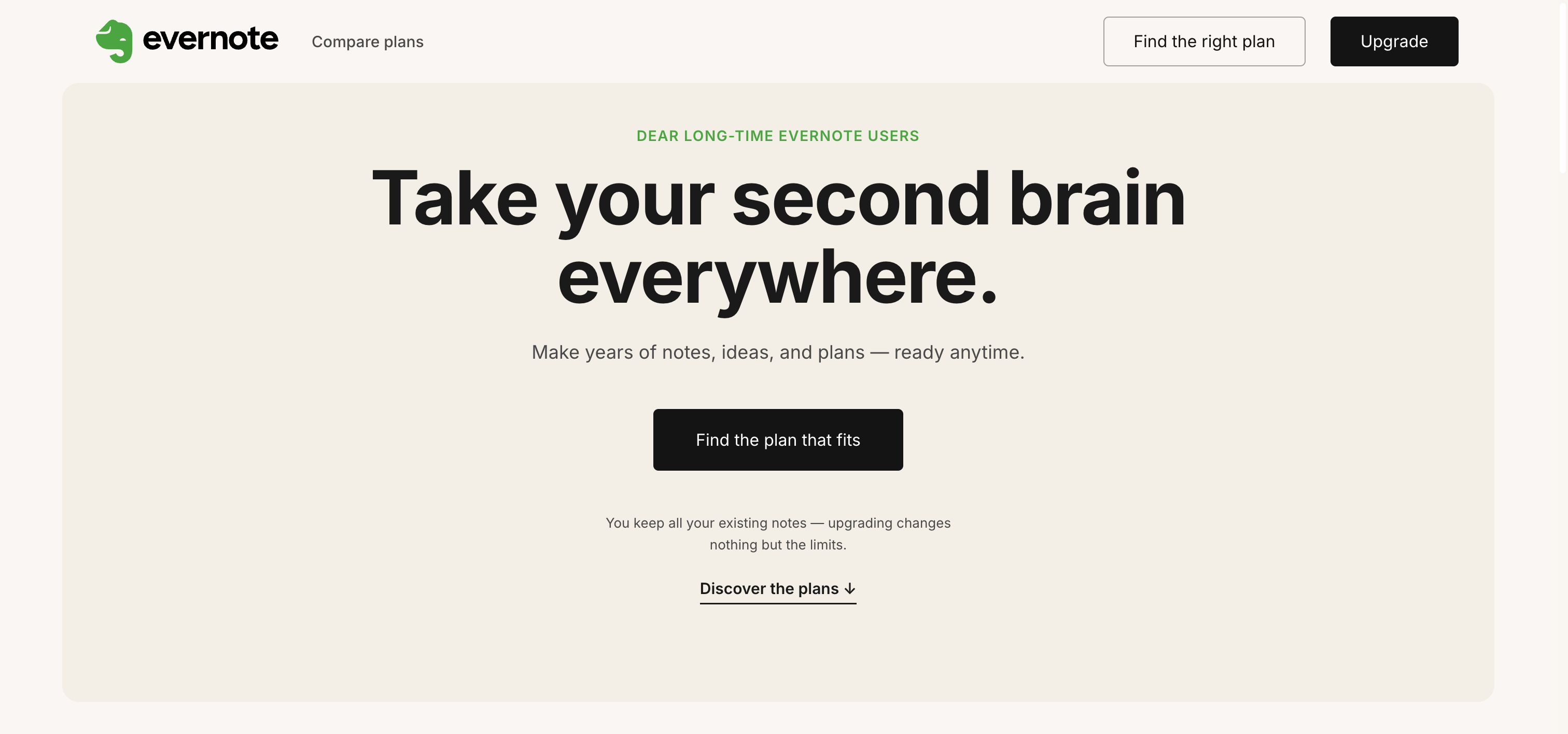
A conversion-focused landing page designed to move long-term Evernote Free users to a paid plan — without pressure. The page is built on Evernote's own design system (colors, typography, shapes) so the upgrade feels like a natural continuation of a product users already trust, not an external sales pitch. Three plans, ten features, two prices: a static, scannable, re-consultable format chosen deliberately over a linear video, because the decision is fundamentally comparative.
Long-time free users rely on Evernote across their whole day — at their desk, on the go, switching between devices. But the Free plan locks them to a single device: the most painful, most everyday friction, buried as a technical footnote. Classic upgrade pages answer this with pressure — countdowns, fake scarcity, guilt. For users who have trusted the product for years, that tone breaks trust instead of building it.
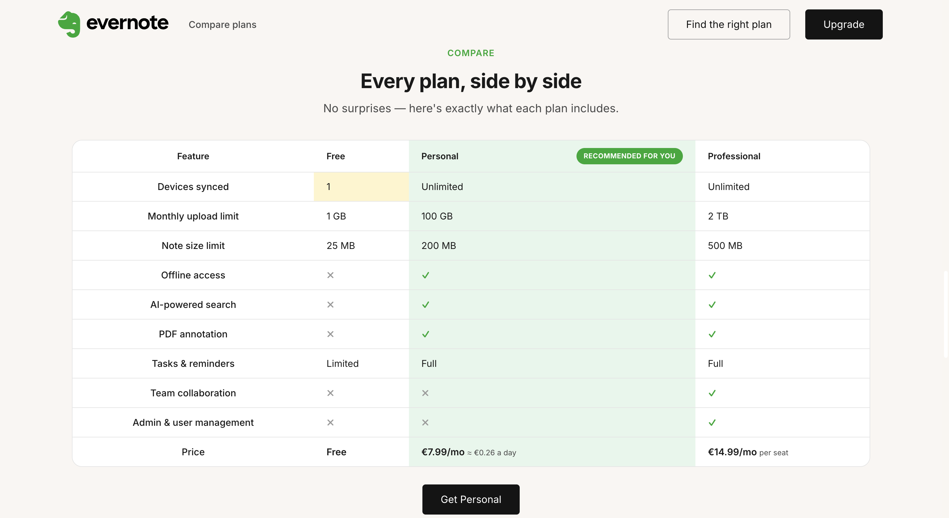
Lead with the single-device limit, framed as a promise instead of a punishment: "Take your second brain everywhere." The page encodes this one key difference three times — in the headline, in a relatable daily narrative ("One note, all day"), and in the comparison table, where the Free "Devices synced: 1" cell is the only element with a divergent visual treatment (yellow fill), so the eye lands there on its own. All pressure elements are removed; the flow ends with a light, non-pushy emphasis on the recommended plan.
Figma · Design system reuse · Conversion copywriting · Comparative decision design · A/B testing framing.
Page Walkthrough
The headline turns Evernote's own "second brain" identity into a portability promise. "One note. Everywhere in your day." grounds it in a real daily narrative: a note captured at work, opened anywhere, found anytime — with the paid-only steps clearly labeled.

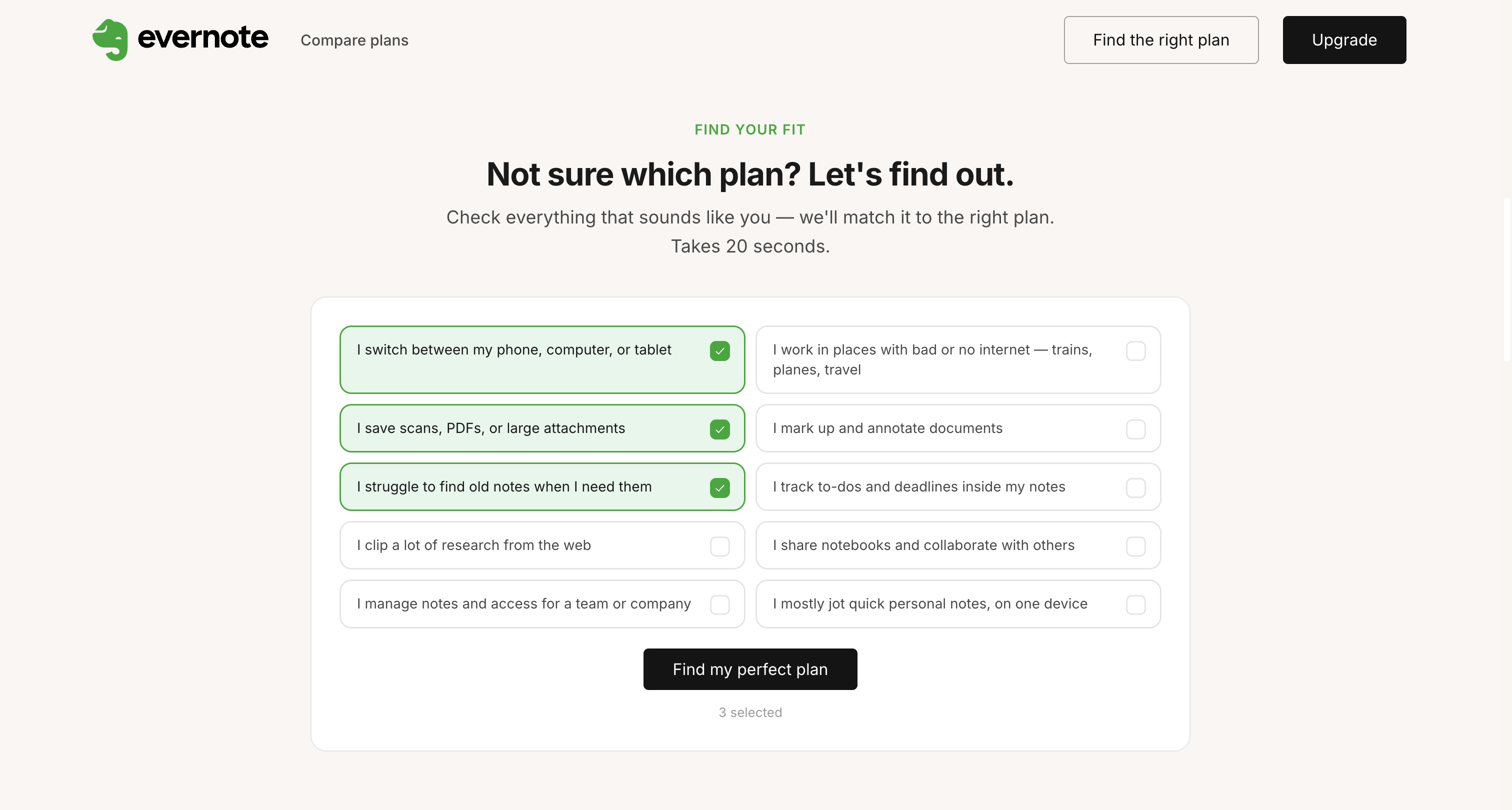
The "Find your fit" quiz replaces presumption with listening: users check the habits that sound like them, and the page matches a plan to their answers. Crucially, the quiz can also answer "Free still fits you" — a quiz that could only ever say "pay" would be manipulation, not service. The result panel shows exactly what the recommended plan unlocks, matched to what the user selected, with the price reframed as ≈ €0.26 a day.
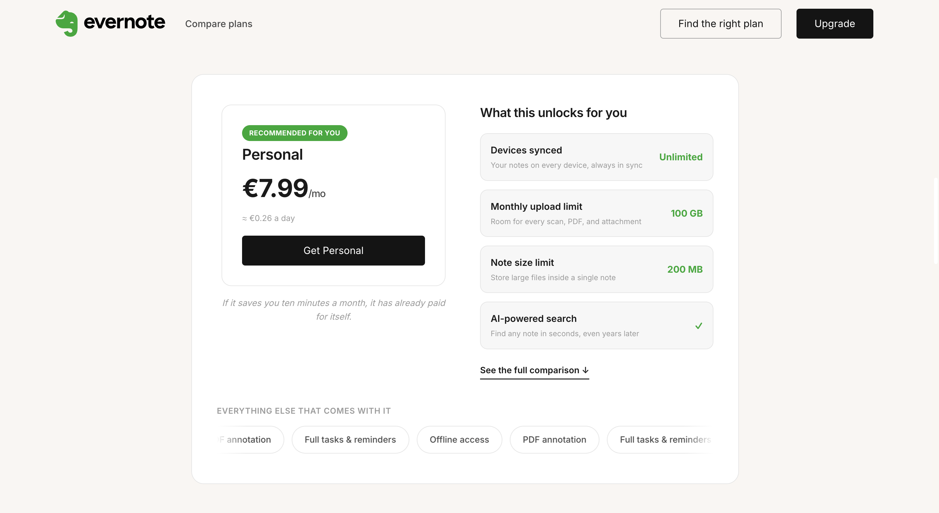
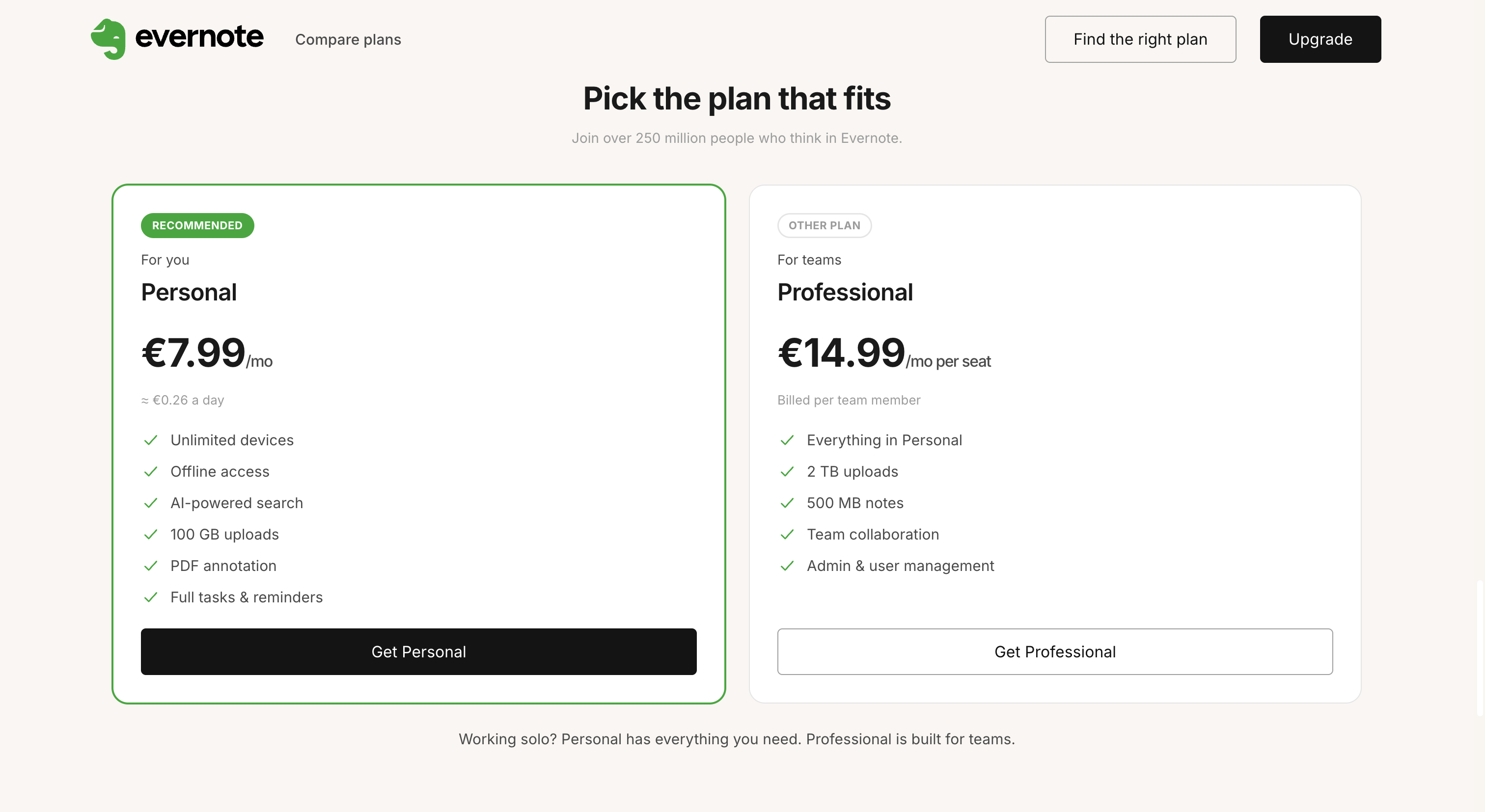
Every functional claim on the page maps to a row of the comparison table — no invented features, prices and the "/seat" note always visible. The Free single-device cell is the only visually divergent element. The final section presents both plans side by side with a recommended badge and a closing line that keeps the choice honest: "Working solo? Personal has everything you need."
Measuring Success
Primary signal: the Free-to-paid conversion rate of users exposed to the page, measured against a control group that doesn't see it — the hardest signal to falsify and the closest to the actual goal. Secondary signal: the quiz funnel (completion rate and Free/Personal/Professional outcome distribution), which explains not just whether the page works, but why.
Contact